
이렇게 생긴 select input을 만들고 싶을 때 일단 DropdownButton으로 시도해보자.
표시되는 값은 '비공개', '남성', '여성' 으로 하고 설정되는 값은 각각 null, 'M', 'F' 를 받기로 한다.
Container(
	child: Column(
    	children: [
        ......,
        DropdownButton<String?>(
              items:
                  [null, 'M', 'F'].map<DropdownMenuItem<String?>>((String? i) {
                return DropdownMenuItem<String?>(
                  value: i,
                  child: Text({'M': '남성', 'F': '여성'}[i] ?? '비공개'),
                );
              }).toList(),
            )
		],
	)
)

비활성화 상태로 동작하지 않는다. onChanged 콜백을 넣어주자.
            DropdownButton<String?>(
              onChanged: (String? newValue) {
                print(newValue);
              },
              items:
                  [null, 'M', 'F'].map<DropdownMenuItem<String?>>((String? i) {
                return DropdownMenuItem<String?>(
                  value: i,
                  child: Text({'M': '남성', 'F': '여성'}[i] ?? '비공개'),
                );
              }).toList(),
            )
이제 클릭하면 선택할 수 있는 옵션이 나타난다.


성별을 입력하라는 label을 바로 위에 표시하고 싶은데, DropdownButton에는 labelTetxt parameter가 없다. 텍스트 위젯으로 표시해본다.
            Text("성별", style: TextStyle(fontSize: 15, color: Color(0xffcfcfcf))),
            DropdownButton<String?>(
              onChanged: (String? newValue) {
                print(newValue);
              },
              items:
                  [null, 'M', 'F'].map<DropdownMenuItem<String?>>((String? i) {
                return DropdownMenuItem<String?>(
                  value: i,
                  child: Text({'M': '남성', 'F': '여성'}[i] ?? '비공개'),
                );
              }).toList(),
            )
왼쪽 정렬하고 DropdownButton은 화면에 꽉 차게 그리고 싶다. '성별' 텍스트와 DropdownButton 사이는 좀 더 붙이고 싶다.
Column에
crossAxisAlignment: CrossAxisAlignment.start,
옵션을 주면 왼쪽 정렬이 되는데, label과 버튼의 간격을 줄이고 DropdownButton을 화면 전체로 만드는 것이 쉽지 않다.


미묘하게 원하는 모양이 나오지 않는다.
DropdownButton 대신 decoration parameter가 있는 DropdownButtonFormField 를 써보자.
            DropdownButtonFormField<String?>(
              decoration: InputDecoration(
                labelText: '성별',
                labelStyle: TextStyle(fontSize: 15, color: Color(0xffcfcfcf)),
              ),
              onChanged: (String? newValue) {
                print(newValue);
              },
              items:
                  [null, 'M', 'F'].map<DropdownMenuItem<String?>>((String? i) {
                return DropdownMenuItem<String?>(
                  value: i,
                  child: Text({'M': '남성', 'F': '여성'}[i] ?? '비공개'),
                );
              }).toList(),
            )
decoration parameter를 제외하면 DropdownButton과 동일하다.


'남성' 을 선택했을 때는 label이 정상적으로 표시되는데, '비공개'를 선택하면 label과 Dropdown이 겹쳐서 보인다.
value가 null 일 때 값이 입력되지 않은 것으로 인식해서 label을 크게 보여주게 동작하기 때문이다.
value를 [null, 'M', 'F] 대신 ['', 'M', 'F'] 로 설정하거나

value가 null일 때의 text를 '' 로 선택하면 이상하지 않게 보인다.
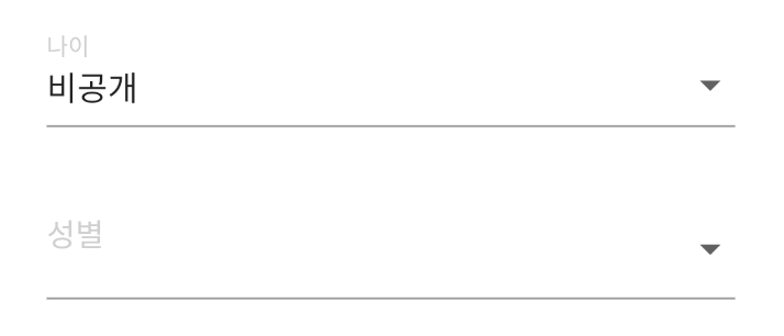
혹은 label이 움직이지 않도록 decoration에 floatingLabelBehavior: FloatingLabelBehavior.always, 옵션을 주면 된다.
            DropdownButtonFormField<String?>(
              decoration: InputDecoration(
                labelText: '성별',
                floatingLabelBehavior: FloatingLabelBehavior.always,
                labelStyle: TextStyle(fontSize: 15, color: Color(0xffcfcfcf)),
              ),
              // underline: Container(height: 1.4, color: Color(0xffc0c0c0)),
              onChanged: (String? newValue) {
                print(newValue);
              },
              items:
                  [null, 'M', 'F'].map<DropdownMenuItem<String?>>((String? i) {
                return DropdownMenuItem<String?>(
                  value: i,
                  child: Text({'M': '남성', 'F': '여성'}[i] ?? '비공개'),
                );
              }).toList(),
            )
